
The coolest Datejust ever.
Rolex 116200 Datejust Concentric Blue Dial
Rolex is not as boring as you think.
Rolex, for good reason, has left a sour impression in most people’s minds. They have garnered many accolades from douchebaggery, hype pieces to boring conservative design. While the majority of their models certainly have a geriatric quality to them, if you look hard enough there exist exciting pieces even from their modern offerings. You have the Pearlmaster, Milgauss, and now this. The 116200 Datejust, one of their most eclectic models.
Oyster case is still unmatched
Features
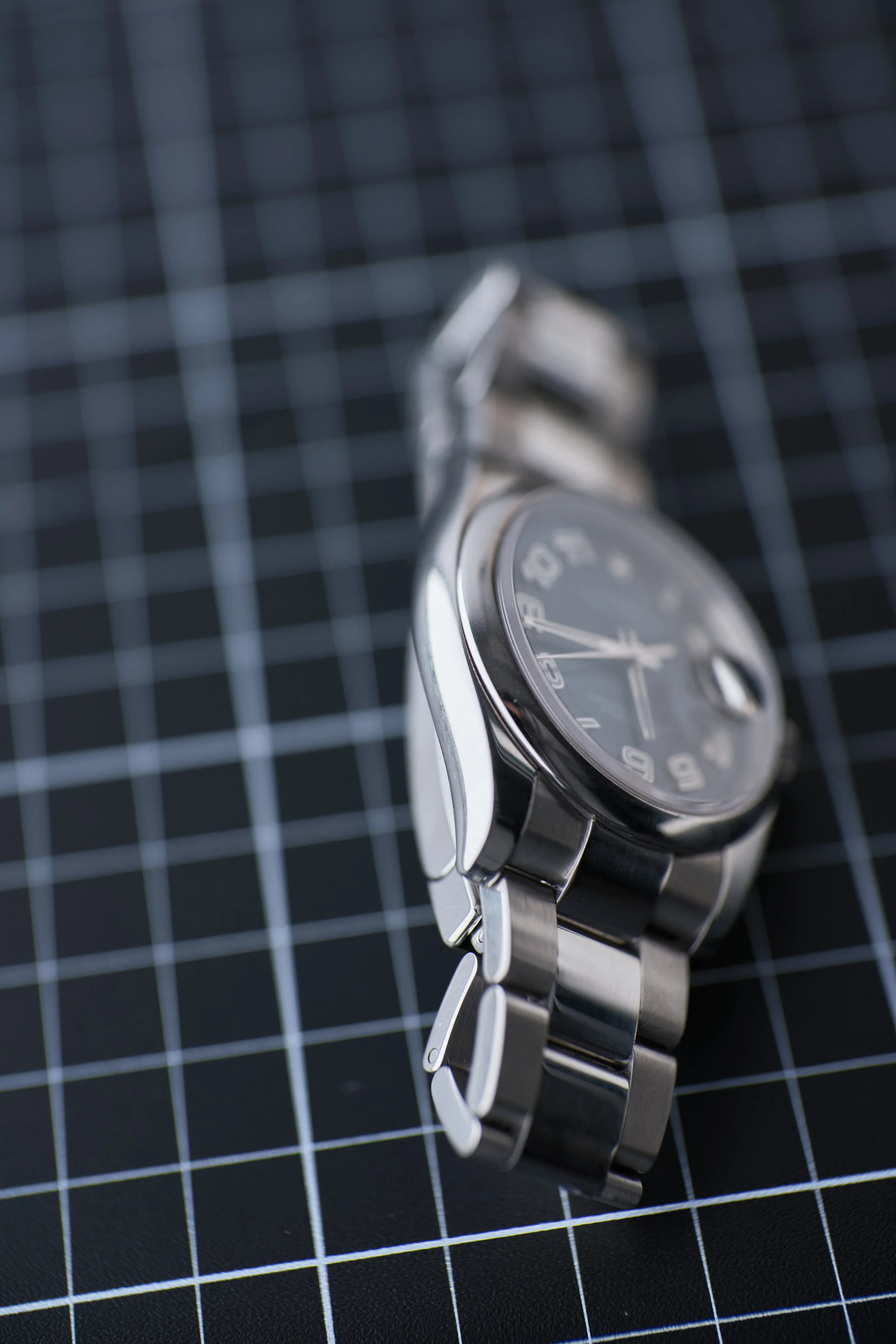
The 116200 is an experimental Datejust housing the 3135 movement from the early 2000s to around 2015. During the period, oversized watches were the trend and Rolex followed suit with the newly sized 41mm Datejust. I think 36mm is the right size for a Rolex case, because the design revolved around those original proportions. Nevertheless, not everyone has slender wrists like I do, and so even this 36mm model utilizes the proportions of the 41mm version, resulting in wide maxi-style lugs reminiscent of a Submariner. In reality, I think the uniquely wider presence of this case makes the oyster case more in line with the tortue case from F.P. Journe and Cartier.
What’s really interesting about these proportions is that the size of the case also becomes more bulbous and curvacious, which I think looks exceptionally good on the smaller watches like the 114200. The curves are more pronounced than the slimness of the modern 126200 range, though it’s a little subjective which is better. Are smaller lugs more aesthetically proportional with the case? Probably. But I can’t shake the feeling that those thinner lugs are like beanpole fashion models and these thicker lugs are healthy and thicc. There’s just more to love!
Look at those curves…
Look at them!
The watches features green lume as opposed to the blue on their recent watches and a 48 hour power reserve, which ticks slightly louder. The watch also has an older style clasp with no springs. The typography is also different, larger on the rehaut and logo, smaller with the “Superlative Chronometer” text and squished letter spacing for “Oyster Perpeptual” to line up better with the rest of the margins. If I had to choose one, I think I find the inconsistent typography on the older model to be slightly more charming, but it’s mostly irrelevant even for someone like me. Other than that, the other difference are pretty subtle from the modern versions, which I’ll detail below.

Sporty arabic hour markers
Similar to a tortue case
‘Rolex’ is larger and taller, ‘Oyster Perpetual’ is narrower, ‘Datejust’ has inconsistent letter spacing.
Design
This watch utilizes one of the coolest art deco sports dials I have ever seen. Normally I prefer the latest and greatest modern offerings, but this dial is discontinued and I doubt they will ever bring it back. It can be described as a concentric blue dial or possible tuxedo variant. I would like to think it’s quite rare, at least mine is because of the roulette date wheel. I actually don’t really like the color blue, but over time I have come to appreciate the vitality and youth it brings to a sports watch especially because I have learned blue is the perfect complement to steel. Normally Rolex blue is quite boring especially when compared to Vacheron or Patek. However, sunburst blue has significant variation from their Oyster Perpetuals and other models. There are minor shifts in saturation and luminance and the main reason I don’t like their normal blue hues is because they’re generally too bright. The blue on this 116200 is actually quite dark to complement the black glossy numbered ring and I think is comparable to the Vacheron Overseas. I’ve interacted with both and although the Overseas is quite exceptional, it can be a little too saturated at times. I appreciate the tasteful reservation of the blue implemented here, which has the perfect amount of vigor and muted brightness, similar to a Patek Ellipse.

Vacheron Overseas has a rich electric blue that can be very loud.
IMG: Hodinkee
Other things I love about the design are the minute markers which use numerals every 5 seconds. I think this is the sportiest variation of Datejusts making it unbelievably cool. it also doesn’t interrupt the design of the main dial, disappearing into the background until you need it. However, this complicated demarcation can be difficult to precisely tell what minute it is from a quick glance.
Any orientation can read the time
Now let’s talk about that stunning dial. This is the most unique dial I have ever seen from Rolex and speaks to me deeply. It’s reminiscent and probably influenced by F.P. Journe’s Vagabondage, which is probably why this design is so limited in quality. It has the same white gold numerals as an Explorer except fully rotating around the dial. I love this quirky design, which makes it legible even if you are looking at the watch upside down. There’s a hypnotic spirally labyrinth that draws from the same inspiration as my own designs. This also makes the cyclops date feel more integrated into the design, which I think really feels like an isolated pimple on some of the other stick marker models. The only thing proportionally disturbing is that the dial design has a heavier weight on the left side as the numerals become larger. But honestly, that is so irrelevant from keeping you from appreciating this complete package. Just the choice to go black on blue is so fascinating, I wonder what this would look like with red and black - The possibilities are endless, Rolex must bring this back out of the vault! But knowing their conservative branding, they will understandably keep this design in discontinued jail just like their best limited colored OPs. The dial is so great that I believe it is better than a Vacheron Overseas, which doesn’t even have hacking seconds, instantaneous 12 o’clock date switch or the reliability of a Rolex. It is for me, an exit watch. That is unless they bring this dial out in a modern casing. Then I will have an existential crisis and probably be licking my chops into debt.
I honestly think this is better than an Overseas and substitutes my grail with no compromises
The date window also seamlessly blends with the arabic markers

You see the resemblance…right?
F.P. Journe Vagabondage from Lunar Oyster.
Pros
It is quite apparent how much I love the dial of this watch. Although this is an older model with aspects inferior to even my more basic modern Oyster Perpetual 126000, I will always prefer the Datejust over that one, even if the cons are significant. I had realized that I do need a date complication and frankly, while the OP is perfect, the charm of this Datejust triumphs over all. And I am extremely fastidious.
I really like polishing on this watch compared to an Oyster Perpetual. Specifically, I like how the centered links on the bracelet contrast with other brushed links, which add some needed intrigue to the bracelet. I also prefer the oyster bracelet to a jubilee and a round bezel compared to a loud fluted one. But it really depends model to model. Something like the Wimbledon dial I would prefer a jubilee bracelet, but for this sporty dial, oyster bracelet makes so much more sense. Although I’m quite nervous about the polishing on the lugs, it lifts the blue hues from the dial and makes the whole watch feel so much more precious. It smudges a lot, which is not a huge deal, but what does matter is that it scratches easily too. Luckily, I personally don’t mind because if it does get scratched then it will end up feeling like a brushed finished and then you will have nothing to worry about!
And then the cherry on top. The date complication utilizes a playful roulette date, which has red numbering on odd dates. This is unbelievably cool especially as I am quite fanatic with all things poker and casino related. The red is such a fun contrast with the blue and black dial, my only quip is that it is too muted for me and sometimes looks black to my colorblind eyes. Nevertheless, it really are these small details that create the joys in life.


Polishing of the case has a mirror like shine
Other differences include longer and lower positioned male end links. Bracelet feels lighter and less stiff so it articulates more, but feels less sturdy.
Polishing lifts the blue tones
Cons
As this is an old and furthermore used watch, there are real cons with the one I own. My watch is over 10 years old and will naturally be missing features on newer models. the 48 hour power reserve was surprisingly noticeable as sometimes I’ll put the watch down for it to not be running the next time I pick it up. But this is a small concern as I generally wear this every day. Mine needs servicing as it’s 10s fast and also the screw down crown feels rusted.
The lume is just OK even despite the large numerals. Unless you shine a flashlight on it, the green superluminova is quite similar to the blue chromalight in brightness for daily usage. It is still bright enough to notice the glow when you briefly drive into a tunnel, so there’s really nothing to complain about as a downgrade. I actually quite like the green on blue so this is hardly a real con, just that it’s not as bright or long lasting as you’d expect from regular usage.
The lugs and polishing are quite subjective as I mentioned earlier. The real problem for buyers is this will be a second hand watch, meaning that dealers will inevitably over-polish it, softening the sharp edges and distorting its shape. These grifters always just say we’re over-reacting, or the watch is basically new - No, there is a difference between new and over-polished. And they will always polish it just to deceive us to make more bucks when pretty much no one wants an over-polished watch. My bezel and clasp are significantly polished down, but with the wider lugs it’s kinda acceptable because they are already so thick that it gives plenty of wiggle room to polish to an acceptable width. One thing I didn’t anticipate is that some polishing jobs will unevenly polish the lugs where one is thicker than another. So these are all things to look out for, which will be hard to see unless the dealer has decent photography sense for their products.
Never polish your watch this significantly
The clasp on this watch uses the old style beak, which has become loose on mine creating a clink clink sound. It also has considerably more resistance when opening and closing as it’s very mechanical in design, creating contact with the clasp. There are many points of failure evidenced by the deterioration on this older watch, which still works but feels like I am hurting it every time I touch it. It is however more secure than the modern spring ones from 2015 and beyond. Those open and close effortlessly, like when Rolex opens the door for you at the AD. But this one feels like you are jimmying open a 2000 Toyota Corolla after a snowstorm.
Mechanical clasp secure but lifts even when closed. Now loose yet stiff and leaves indents on the clasp.
All of these flaws are insignificant, but there is one that is hard to ignore. There is no underside AR coating on the sapphire crystal. There is however double sided AR coating on the cyclops, which I didn’t know at the time. As a result, I ended up scratching some of the AR coating off with a microfiber cloth creating a very annoying spec. Over time, this cyclops will get scratched just from brushing your cuff over it. I just think it’s so weird that they would put double AR coating on the cyclops but none on the main crystal. This makes it so whenever you look at the watch your eyes automatically gravitate toward the date rather than the time as it’ll be significantly more clear. Without underside AR coating for the dark dial, reading the time will look quite cloudy. I have the modern OP 36 with underside AR coating and it’s a noticeable difference. This makes it so it’s a little hard to appreciate the dial or read the time as there is almost always a veiling glare. This is the same disappointment with the Vacheron Overseas or F.P. Journe watches, which have beautiful dials you can’t see because of glares. However I don’t think this really dissuades or makes me love the watch any less. Just like a perfect wife, you’ll just learn to accept their beauty over the flaws. That being said, please be careful with your cyclopses.
Not always easy to read the minutes


Final thoughts
Ignore the haters, at the end of the day, the watch that’s for you and the one you want to wear is the perfect keeper.
This is an extremely sentimental gift for me and it’s also made me learn things about myself. I typically like new and modern specs, but sometimes it’s okay having compromise. As good as some of the perfect specs are from the Oyster Perpetual, I prefer this watch 10 times out of 10. It’s not about specs or perfection. It’s about what speaks to you.
Nowadays Rolex is pretty much synonymous with douchebaggery. The hate and stigma is quite high and frankly were I to wear this in the States I may also feel a little insecure, though a little better because this is a hipster Datejust, not a hype piece, I guess? But I have never fanboyed Rolex for their brand, I just like their watches because they create quality timeless pieces and are the only ones to fit my wrist the way I want. Yes, they are expensive and even unobtainable creating disdain and resentment. Influencers have in a sense ruined public perception of this brand, but I don’t care. It is no different when watch snobs tell you your Seiko is cheap than it is for the average joe to hate your douchebag Rollie. And if that is the barrier to entry, then so be it. People need to stop catering their personalities for other people’s approvals because if we don’t, then we’ll never come to appreciate inconvenient beauty when it finally does appear. And if you hate what this Rolex represents, then you may be missing out on one of the most exciting watch designs for the value.
Recommendations


Rolex is not as boring as you think.